The Local rock House in Waiheke Island, New Zealand - Nyári rezidencia modern kőburkolatokkal.
2012.08.02. 13:24
 Patterson Associates have designed this Summer residence on Waiheke Island, New Zealand.
This beautiful Islands is famous for its vineyards and local wine.
 Located on a steep coastal escarpment above a tree fringed white sand beach the home uses
the same local pyrite rock strata responsible for the quality of the vines, to create Architecture.The rock mass forms a bridge to exploit both the sea frontage and sunlight, under this, a living
area nestles into the landscape contrasting a spacious ocean front terrace to the East with a
grotto-like western courtyard. Bedroom areas are grouped above as finely scaled louvered
metal lookouts in the canopy line of the trees and these close up like an oyster when the house
is empty.The building uses its materiality to compliment and reflect the beauty of its locality; it feels
like like it belongs here. Andrew Patterson’s strategy is that its occupants will feel the same
way.
 A waiheke-szigeti nyári rezidenciát (Új-Zéland) a Patterson Associates tervezte. Ez a
csodálatos sziget híres szőlőiről és a helyi borokról.A fákkal szegélyezett fehér homokos part feletti, part menti meredek lejtőn elhelyezkedő ház építésénél ugyanazt a pirit kőzetet használták, ami a helyi borok minőségének is a titka. A ház kőtömege hidat képez, miközben ki is használja a tenger és napfény adta adottságokat.

A tájba illeszkedő lakóegységgel kontrasztos a tágas óceánra néző keleti tájolású terasz és a
barlangszerű nyugati udvar. A fák lombkoronájának vonalában finom arányú fém lamellák
borítják a hálószobákat kívülről és ezek osztrigaként zárulnak, amikor a ház üres. Az épület anyaghasználata kiegészíti, valamint tükrözi a hely szépségét; olyan mintha oda
tartozna. Andrew Patterson stratégiája az, hogy a ház lakói is ugyanezt érezzék.
The Contemporian Luxury Beach and Golf Resort in Algarve , Portugal - Kortárs Minimalista Golf Klubház együttes lélegzetelállító medencével
2012.07.31. 11:58
 Casa Vale Do Lobo borrows the name from its proximity to the Vale do Lobo luxury beach and golf resort in the Algarve region of Southern Portugal. Focusing attention both on the white architecture pierced by glass walls and on the extraordinary swimming pool, architect Vasco Vieira of Arqui+Arquitectura composed a light-flooded modern architectural masterpiece. Extending the house in a U-shaped floor plan, this fascinating water feature cantilevers and flows into the pool below. From the wooden deck connecting the pool and the house, owners and guests can enjoy the surroundings, while the interiors were designed on several levels, challenging everyone to experience different vantage points from which to observe the natural surroundings and the man-made pool structure.
The Minimalis Villa W in Taunus ,Germany by CMA - Minimalista villa épület ,letisztult belsőépítészettel
2012.07.16. 12:04
 This luxury building is located on a southwestern slope, with a great view over the hilly landscape of Taunus (Germany). This landscape inspired the shape of this structure.
The building’s strict geometry negotiates between the neighboring buildings and tries to conect without closing-up or crowding the space. The house consists of a white, L-shaped body– containing the bedrooms on the upper floor – located over a U-shaped living area on the ground floor. The basement is being used to house guests and the Wellness area can be found there as well.
The lack of a gas supply line was the initial point for developing the structure’s energy scheme. The latter implied the usage of geothermal energy being the most ecologically worthwhile and forward-looking solution.

The Inspirative Dynamic Colorful Loft by Jean Verville - Inspiráló színes Loft Montreálból
2012.07.09. 14:18
 Collecting contemporary art is an occupation that takes up a lot of space. This necessitates a collection of spaces where art stands out, but merging this with a living space posed a challenge for architect Jean Verville, who worked on this project located in downtown Montreal. The Canadian architect designed a loft for an art collector, basing the concept on an unusual set of focal points. Colors make up an interesting, playful space arrangement, while the pure white details soften the overall atmosphere. The Colorful Loft not only displays astounding creations, but it also becomes a modern studio filled with inspiration for the artist’s new projects. Captured in between the walls of this bright and open space, objects, colors and textures mirror in one large wall, accentuating the need for a slightly simpler bedroom. Yellow floods this private space, helping in hiding storage spaces and creating a dynamic interior design even in the absence of usual furniture.
The Black and White Miami Residence, by Nacho Polo- Neobarokk , fekete - fehér lakás belsőépítészet
2012.06.29. 15:19
 Nacho Polo, Miami designer has fashioned his own language for starkly white. He’s added a bit of drama to white while respecting its formal purity. He used white to create glowing brightness and accentuate the essence of his Nineteenth Century apartment and recent furniture by Maarten Baas, Bertjan Pot and Marcel Wanders.
Madrid-born and Miami-based designer and architect Nacho Polo’s apartment retains a classic mood, yet indulges minimalist cleanliness. “I could not live without a notebook with blank pages and a pencil to draw,” he claims. In a sense, he has treated his apartment as a white canvas, dripping sensual accents of black paint and classic elements of crown moldings and carpentry.
Contemporary House Constantia Kloof in South Africa - Extavagáns építészet Dél Afrikából
2012.06.28. 15:42
 Johannesburg-based design studio Nico van der Meulen Architects have completed the ‘House The’ project. Built in 2012, the contemporary home can be found in South Africa.
Following the trend of making alterations to and revamping existing houses, the owners of this contemporary South African home enlisted the expertise of Nico van der Meulen Architects for a modern upgrade.
According to the architects: “They liked the current trend in our work towards a mix of steel construction and concrete framing.

“The new design was achieved by removing most of the internal walls on the ground floor and adding a porte cochere and a new lanai with an infinity edge pool. The impressive porte cochere is suspended from a semi-circular beam supported by the bisecting wall and a huge column and transfer beam over the pool. The element of water was added into the design with a koi pond to the north side of the existing lounge, with glass stepping stones that lead to a new pivoted glass front door. A small waterfall at the front door adds the welcoming sound of water, while a huge sheet of water is visible through a cut-out in the massive rusted steel wall bisecting the contemporary South African house to create a private pool area.
“M Square Lifestyle Necessities decorated the interiors using a palette of monochromatic colours with the interior furnishings in similar and contrasting colours. Accents of green were used sparingly to add fresh splashes of colour. The modern lines of the furniture are a continuation of the interior structural lines. As the structural interior elements are simple with sharp lines, attention is brought to the furniture pieces and decorative items within the interior. For this project, the interior designers professionally created these interior spaces with the use of its unique imported products, Molteni and C, Zeus and Ligne Pure. The designers cleverly balanced the stark simplicity of the structural elements with carefully selected and placed furniture pieces, colour schemes, soft furnishings and decorative details.
“The end result is a home with a liberated feel – as if the normal rules of a suburban home have been suspended, with light, nature and views from everywhere.”

Beautiful Bedrooms in Caro Hotel by Francesc Rifé Studio in Valencia,Spain - Gyönyörű hálószoba ötletek egy Spanyol hotelból
2012.06.24. 08:37
 Francesc Rifé Studio have completed the interior of the Caro Hotel in Valencia, Spain.Project description:
Located in the heart of the city, little more than 200 metres from Valencia Cathedral and the Basilica, the Caro Hotel is the first historical monument-hotel in Valencia. An urban and commercially independent hotel, the establishment has intelligently merged the legacy of historical substrata lying within its walls with the most vanguard of interior design.
 Unique and authentic in style, the project undertaken by the interior designer Francesc Rifé is meticulous in its attention to detail, imbuing the hotel with a contemporary air, clean, geometric lines, which merge seamlessly with the original architectonic features of the former Palace of the Marquis of Caro, whose eclectic facade dates back to the nineteenth century. Beyond its facade, its walls stand guard over an unparalleled inheritance of more than 2,000 years of history, of which the original mosaic belonging to the founding city of the Roman era, «Valentia Edetanorum» (2nd century B.C.), the thirteenth-century Arabic defensive wall, several gothic arches and nineteenth-century constructions have been preserved, restored and integrated into its spaces.
Luxory Modern Penthouse design in Budapest from ARCHIKRON - Modern Luxus Penthouse lakás Belsőépítészet Budapesten
2012.06.19. 17:28
 Finally the work be ended. 3D visualization: http://archikron.blogspot.hu/2010/12/luxory-modern-penthouse-design-in.html
Look at this modern Hungarian penthouse design is located in Budapest designed by Archikron Interior Design Studio. Luxury interior decorating ideas combine with contemporary furniture design is truly making a warm and comfortable atmosphere. Here it is the first sample interior pictures about penthouse.
 Végre kész lett !... Budapest egyik kertvárosi lakónegyedébe terveztük - http://archikron.blogspot.hu/2010/12/luxory-modern-penthouse-design-in.html - és kiviteleztük ezt a közel 200 m2 es Penthouse lakást Az Archikron építész Belsőépítész studio keretein belül.
A lakás 3 traktusból áll :nappali - konyha - étkező, háló , wellness ,spa. A terek hangulatát a sötét tónusok határozzák mg kiegészítve világos mobiliákkal , kőburkolattal , ill textiliákkal. A nappaliban helyet kapott egy MANOOI csillár is amely kivételes atmoszférát ad az amúgy sem unalmas belső enteriőrnek. A konyha egy térben kapott helyet a a nappalival ,intimitását egy elválasztó üvegfal biztosítja ,amely légies áttetszőségét kihasználva teremt kapcsolatot az adott helyiségek között.
A hálószobába érezzük leginkább a sötét tónusok dinamikáját , amiről csokoládé árnyalatú kétszer késelt wenge furnér , és antracit színű csempe ,vinil tapéta gondoskodik.A háló közvetlen kapcsolatban van a fürdőszobával csak a tv fal ,és a nyitható edzett üvegfal szab határt a két helyiségnek.A wc mögötti furnéros fal halszálka motívuma , a zuhanyzó üvegfalai ,és a süllyesztett mosdót övező bútorok egyenként és így összepárosítva is működnek. Fontos szerepet kapnak a lakás enteriőrében a textiliák amelyek részben stúdiónk részben a tulajdonosok ízlését dicsérik.Összességében megpróbáltunk olyan kortárs design-t alkotni ahol teret kap a tervezői fantázia is ,de a meleg családi otthon mint szempont is az első helyen áll. A fotókat London Katalin készítette.
The Extravagance Cocoon House in Korea - Meghökkentő és extravagáns koncepció Kóreából
2012.06.18. 16:18
 The Cocoon House at Jeju island, Seoul is home architecture inspired volcanic living in amazing Korean home planning. In their home planning gallery created a wonderful techniques for Cocoon house decor of Korean home architecture. Architect describe in nature home building like cocoon for protect inner living. The construction home planning started from 2012 till 2015.
The cocoon home decor creates an art piece of cocoon as an eco-home design. This seaside resort located in UNESCO Heritage Jeju Island of the cocoon house with the circular windows, it’s unique home decor seems like a live cocoon.
The floor, wall and ceiling to have inspirational home space with new perspective on private gallery, library, and party space. The volcanic home inspired island Jeju in a unique forest enables of diverse living things.
Nature home planning is environment-friendly interior and exterior finishing materials made from Jeju. Healthy and pure house includes an open air pocket pool enables swimming to feel enjoying the nature of Jeju island. The cocoon house located in ‘Gotjawal Village’ of the ‘Jeju Airest City’ in new concept of condominiums city.
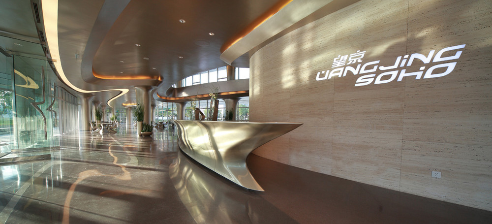
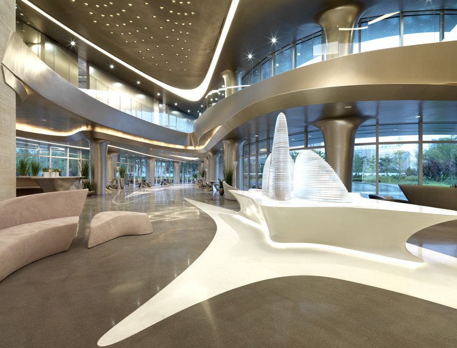
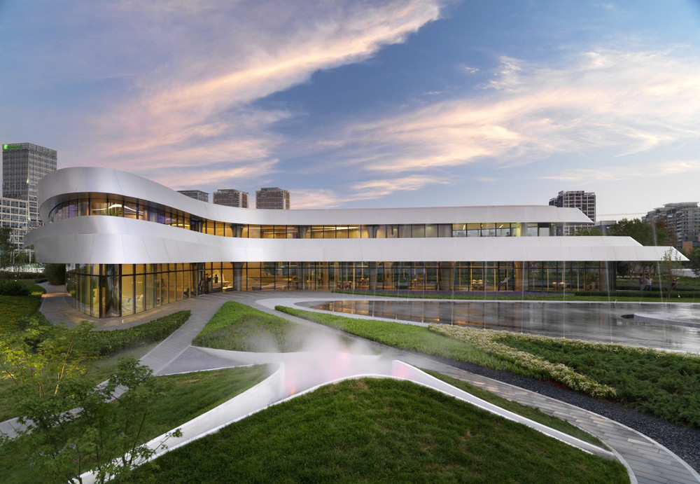
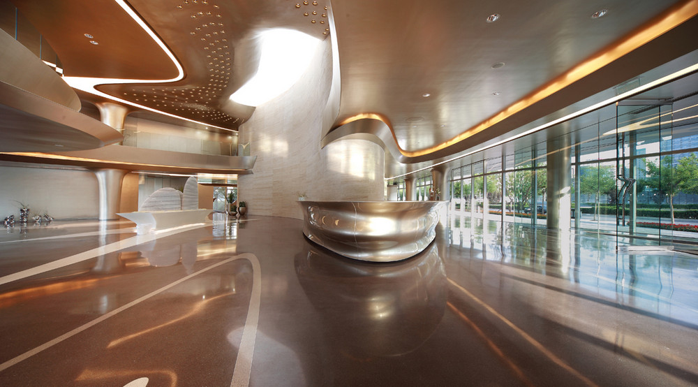
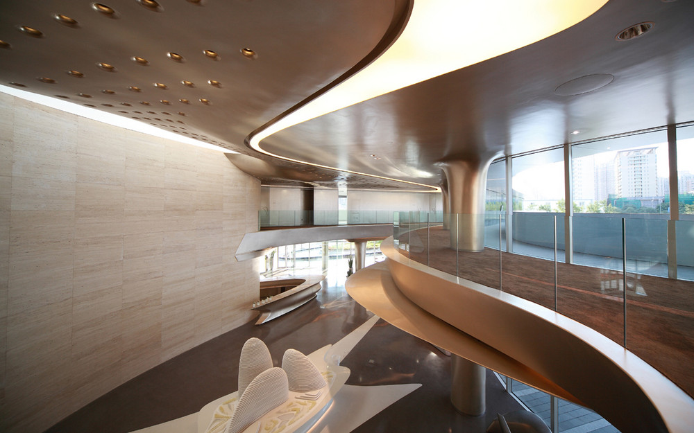
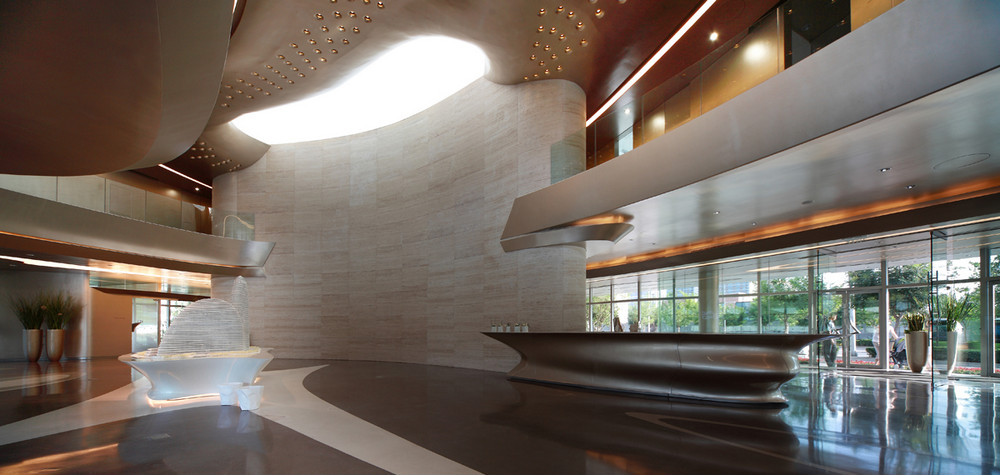
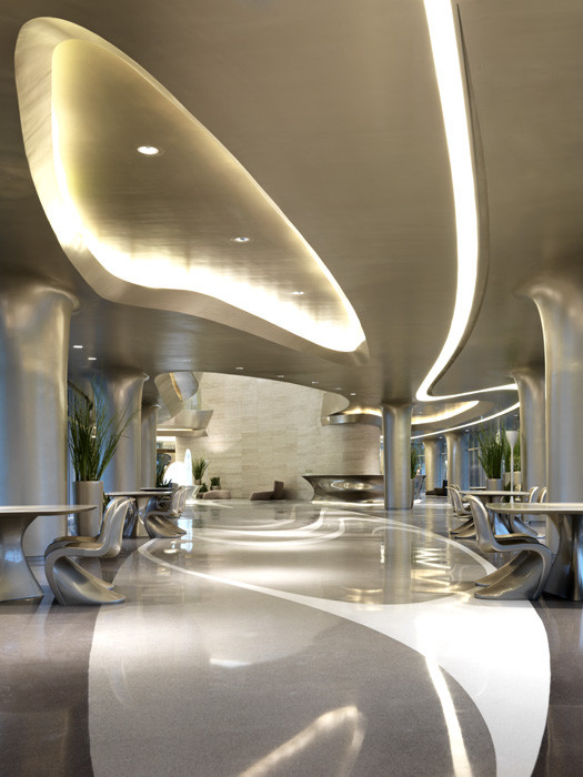
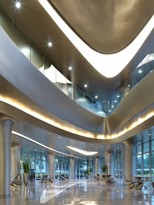
The High End Office Building - Wangjing soho by Zaha Hadid
2012.06.14. 08:28
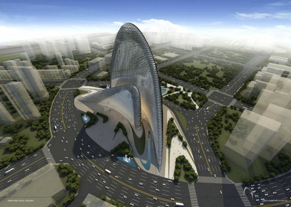
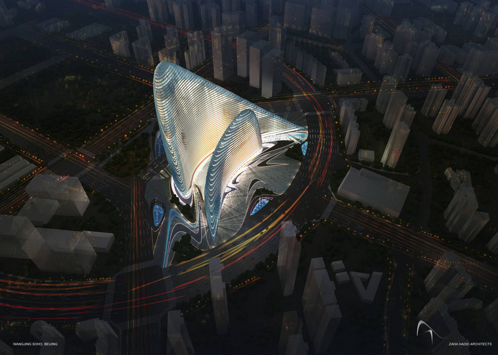
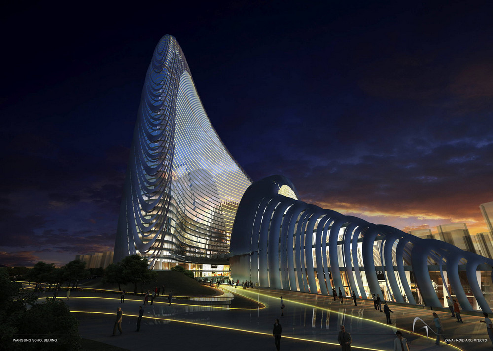
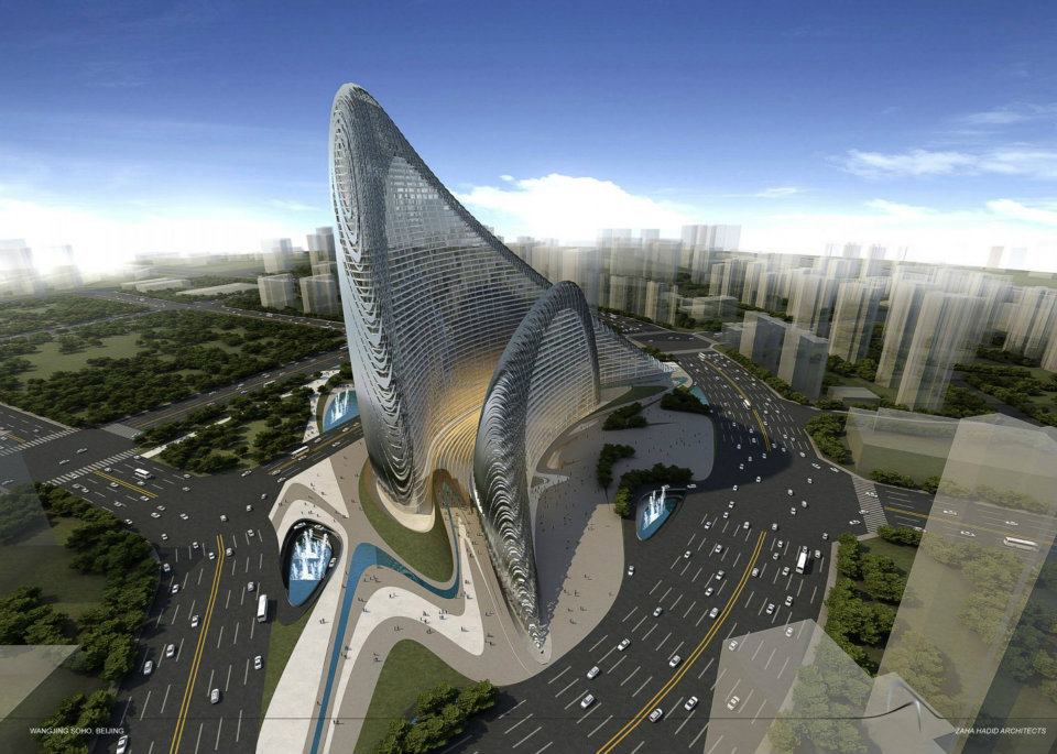
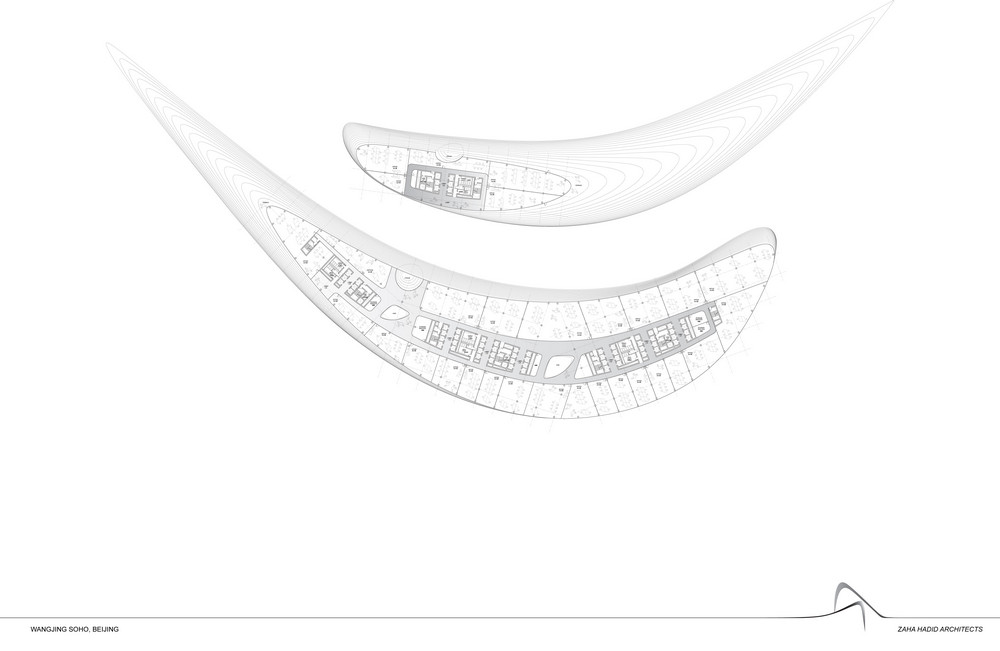
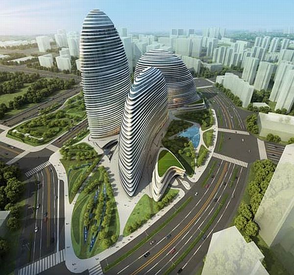 Zaha Hadid Architects have released new renders of a 200-metre-high commercial complex designed for Beijing.
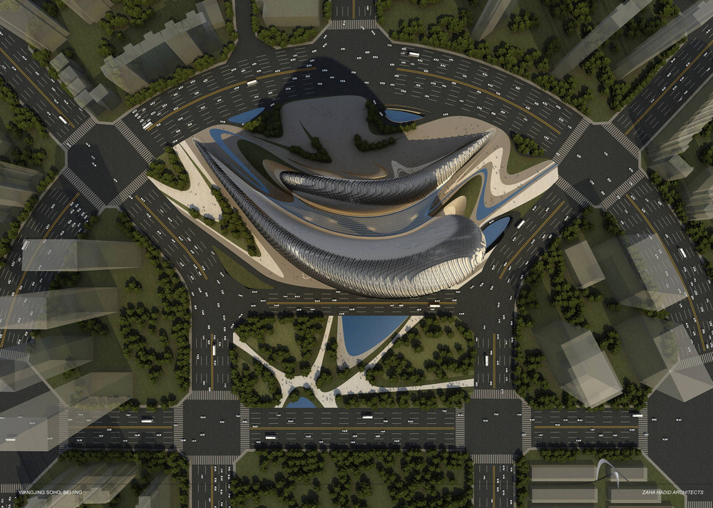
the Wangjing Soho complex will comprise three large pebble-shaped buildings overlooking a road that leads to Beijing Capital Airport.
A three-storey retail podium will occupy the basement, ground and first floors of the buildings, while up to 37 floors of offices will be located above
Here are a few more details from the architects:
Wangjing Soho
Beijing, China
the Wangjing Soho building complex is a beacon along the way to Beijing’s modern gateway, the Capital Airport, and the journey of transition to and from the city.
the project acts as a welcoming post to the city and a gesture of farewell when departing Beijing. the buildings achieve this by reading differently when transitioning in either direction, leaving distinctly different impressions on those who pass by.
Like Chinese Fans, the volumes appear to move around each other in an intricate dance, each embracing the other from a continuously changing angle. this interplay creates a vibrant architectural complex that is enhanced by an equally dynamic external skin, which continuously varies in density creating a shimmering, exciting presence.
The Impressive Minimalist Renovation in Melbourne, Australia - Elképesztő Családi ház felújítás bátor színekkel
2012.06.12. 07:19
 Wow this is impressive, brave use of colour which looks great – an old heritage house converted into modern home with touch of heritage background. Currently shortlisted for 2012 Colour In Residential Design & Residential Design Award.
Designed by Matt Gibson Architecture + Design

Elagant Contemporary Curved House in Springfield, Missouri. - Kortárs Minimalista Bungaló letisztult családias Belsőépítészettel
2012.06.05. 17:22

Kansas City-based design studio Hufft Projects have completed the Curved House. Completed in 2009, this modern family home can be found in Springfield, Missouri.
According to the architects: “The contemporary Missouri home is a modern residence with distinctive lines. Conceived in plan as a U-shaped form, this residence features a courtyard that allows for a private retreat to an outdoor pool and a custom fire pit. The master wing flanks one side of this central space while the living spaces, a pool cabana, and a view to an adjacent creek form the remainder of the perimeter. A signature masonry wall gently curves in two places signifying both the primary entrance and the western wall of the pool cabana. An eclectic and vibrant material palette of brick, Spanish roof tile, Ipe, Western Red Cedar, and various interior finish tiles add to the dramatic expanse of the contemporary Missouri home. The client’s interest in suitability is manifested in numerous locations, which include a photovoltaic array on the cabana roof, a geothermal system, radiant floor heating, and a design which provides natural daylighting and views in every room.”

Corallo House- Minimalist Family residence in the Forest by PAZ - Minimalista erdei villa Guatemalából
2012.05.31. 16:07
 Paz Arquitectura have designed the Corallo house in Guatemala city, Guatemala.Located on a dense hillside forest in the Santa Rosalía area of Guatemala City, Corallo House integrates the existing forest into the layout of the house. It merges nature into the architectural intervention. The design process began with the aim to preserve the existing trees, in order to have the trees interact with the living space.
The floor plan is free of columns and the changes in level adapt to the existing topography. Both façades are mostly glass in order to connect the interior to the exterior. The main structural component is exposed concrete, which shows the rustic texture of the wood formwork, allowing a dialogue between the formal element and the textures of the forest.
Casa Finisterra - Luxory Beach Villa on The Rock by Steven Harris Architects - Modern luxus Villa sziklákra ültetve
2012.05.24. 14:43
 New York city-based studio Steven Harris Architects has designed the Casa Finisterra project.
This 9,000 square foot, five bedroom, seven bath contemporary home Sits upon a breathtaking promontory in the exclusive gated resort-community of Pedregal in Cabo San Lucas, a city at the southern tip of the Baja California peninsula, in the Mexican state of Baja California Sur.


This 9,000 square foot, five bedroom, seven bath contemporary home Sits upon a breathtaking promontory in the exclusive gated resort-community of Pedregal in Cabo San Lucas, a city at the southern tip of the Baja California peninsula, in the Mexican state of Baja California Sur.
Geometrical Concrete House in Shanghai by Archi-Union Architects - Geometrikus beton ház koncepció Kínából
2012.05.15. 14:23
 Shangai-based design studio Archi-Union Architects has designed this Tea House and Library. Completed in 2011, this contemporary tea house is located in the backyard of their office, in Yangpu District, Shanghai, China.
According tot he architects: “The Tea House is constructed from salvaged parts of a collapsed warehouse roof. The site was extremely constricted with walls on three sides, with only one side facing towards a nopen space that contains a pool. The space was further restricted by a mature tree.The design tries to embody harmony by integrating enclosure and openness, delightful space and logical construction and other complicated relations.
This contemporary Chinese property reacts to the site’s environment; the plan layout is a logically obscure quadrilateral, thus maximising the amount of space. It is divided into three parts. A covered public area is formed towards the open space with the pool, with an enclosed tea house at ground level and library on the first floor where a small triangular balcony extends around the existing tree. Other more private spaces exist such as a lounge, reading room and service room which are arranged towards the rear of the building; a delightful transitional space was created to connect the public space and the private spaces.” Images courtesy of Zhonghai Shen.
NaCi House - Interesting and Creative Family Residence in Bethesda, Maryland - Kreatív többszintes családi ház minimalista elemekkel
2012.05.14. 15:11

NaCi House has been designed by Virginia-based David Jameson Architect Inc. The contemporary home is located in Bethesda, Maryland.
According to the architects: “Breaking the prescriptive mold of horizontally layered homes, NaCl House aspires to render unclear the spatial organisation of the project and explore an architecture of ambiguous scale. The resultant massing reveals an imperfect, rough-hewn form recalling the natural isometric formation of mineral rock salt.
“The exterior composition is read as a single object that reflects a dynamic fluid interior. Uncorrelated to the buildings structure, glazing panels are detailed flush to the exterior surface, eliminating shadows which further inhibit a reading of the buildings scale.”
The contemporary Maryland property appears like a childs building blocks but with a white-wash facade. However, once inside this is no child’s play – the chic home is a true reflection of a modern 21st century home. What do you think of this contemporary property in Maryland? Images courtesy of Paul Warchol.


